Pages

Thursday, January 26, 2012

The Making of Our Comic "Justine" pt. 3a

I said I’d post some thumbnails and pencils of Justine and who delivers on her word? …three months later. Sorry about that.

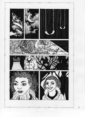
Anyways, in continuation from Pt. 1 and Pt. 2, below are the thumbs and such for page one along with its respective page from the script. (Page four and page ten are posted separately below). Comparing the text to the art, you can see how things changed and moved around and were interpreted in different (but wonderful) ways than what I’d envisioned.

This was our first time collaborating on a comic, so we learned a lot along the way. For Justine, I didn’t send Jose my own thumbnails along with the script like I’ve been doing for this project. Then we learned how nit-picky (especially when it came to designing lead characters) I could be. Thus, our current process was born saving us a lot of back and forth about little things.

I’ll let the sketches and drawings speak for themselves since—well, they are images. Also, I didn’t draw them so there’s not a lot I can say about the thought process behind them.

Le Script

PAGE ONE(7 Panels)

PANEL ONE

A white puff of breath on the cold night air.

CAPTION: Few know the true scent of a werewolf.

PANEL TWO

The thin, glowing moon peeks out between the clouds.

CAPTION: What lies beneath the reek of blood and death on their breath--

PANEL THREE

The rusting metal bars and chains of a swing set seem to give off a chill.

CAPTION: --or beyond the odor of aggression and anger– yes, those have a smell too.

PANEL FOUR

A pair of petite feet in white winter boots and white tights walk over a sidewalk whose many cracks are over grown with weeds.

CAPTION: But once you know, it’s a stench so pungent you’ll recognize it from miles away.

PANEL FIVE

A girl in her late teens walks past a crumbing wall that’s immersed in shadows. A medium-close sort of shot that starts just below her nose and cuts off maybe around her elbows which stick out slightly because her hands are in her pockets. In the shadows behind her, a pair of red eyes glow and the glint of the moon hits a sharp fang wet with saliva. We’re maybe able to see the faintest outline of the monstrous face hidden in the shadow.

CAPTION: The young ones especially don’t know the scent.

PANEL SIX

Front view of the girl reacting with surprise to an unseen voice.

VOICE (O.P): Hey, little girl, you shouldn’t be out by yourself this time of night.

PANEL SEVEN

The girl relaxes and smiles nervously. Same front view of her, but this time there’s a shadow behind her moving away from the wall.

GIRL: I couldn’t sleep.

Thumbnails

Pencil Layout

Black/White Comp

Color Comp
(with out limited color palette, the difference between the color and b/w comps is subtle on this page. Can you spot it?)

Final Pencil Comp

Inking

Final Page

Hey, since you’re already here, check out page four and page ten too! To read the story in its entirety click here.

The Making of Our Comic "Justine" pt. 3b

Making of PAGE FOUR starts below:

I said I’d post some thumbnails and pencils of Justine and who delivers on her word? …three months later. Sorry about that.

Anyways, in continuation from Pt. 1 and Pt. 2, below are the thumbs and such for page four (my favorite page!) along with its respective page from the script. (Page one and page ten are posted separately). Comparing the text to the art, you can see how things changed and moved around and were interpreted in different (but wonderful) ways than what I’d envisioned.

This was our first time collaborating on a comic, so we learned a lot along the way. For Justine, I didn’t send Jose my own thumbnails along with the script like I’ve been doing for this project. Then we learned how nit-picky (especially when it came to designing lead characters) I could be. Thus, our current process was born saving us a lot of back and forth about little things.

I’ll let the sketches and drawings speak for themselves since—well, they are images. Also, I didn’t draw them so there’s not a lot I can say about the thought process behind them.

Le Script

PAGE FOUR(10 Panels)

PANEL ONE

The girl drags her heels in the sand to stop. She looks at him seriously.

SFX HER FEET (small): shrrrr

GIRL (Off Panel): Okay...

PANEL TWO

Medium-close on girl. No longer swinging, she holds onto the chains of the swing in both hands and looks at him seriously.

GIRL: I’ll tell you about monsters then.

PANEL THREE

He watches her as she talks.

GIRL: Some are small and creeping. Some are huge and roaring. But there’s one living inside of every one of us.

PANEL FOUR

She looks down at her stomach and grabs a fist full of her coat.

GIRL: Mine screams to be released every night, but I hold it in. You know why?

PANEL FIVE

Close on girl’s face. She gives him a severe look.

GIRL: Ahem.

GIRL: You know why?

PANEL SIX

Close on man’s face. He rolls his eyes again.

MAN: Why?

PANEL SEVEN

She jumps to her feet deeply convicted by her own words. She stares forward over the mass of riveted listeners who aren’t there.

GIRL: Because we all have the choice to control the monster or let the monster control us and if we let the monster have control, then that’s what we become! Monsters!

PANEL EIGHT

Close on girls face.

GIRL: Do you know what I mean, Mister No-Name?

MAN (O.P.): Heh heh.

PANEL NINE

The man falls off the swing doubled over with laughter. She turns to look at him.

GIRL: Why are you laughing, mister?

MAN: A-HA HA HA HA HA!!

PANEL TEN

Close on man’s face. His expression changes from amusement to pain, as he clutches himself.

MAN (moaning): Ah... Ugh! Uh!

GIRL (O.P): Mister?

Thumbnails

Pencil Layout

Black/White Comp

Color Comp

Final Pencil Comp

Inking

Final Page

Hey, since you’re already here, check out page one and page ten too! To read the story in its entirety click here.

The Making of Our Comic "Justine" pt. 3c

Making of PAGE TEN starts below:

I said I’d post some thumbnails and pencils of Justine and who delivers on her word? …three months later. Sorry about that.

Anyways, in continuation from Pt. 1 and Pt. 2, below are the thumbs and such for page ten (my other favorite page) along with its respective page from the script. (Page one and page four are posted separately). Comparing the text to the art, you can see how things changed and moved around and were interpreted in different (but wonderful) ways than what I’d envisioned.

This was our first time collaborating on a comic, so we learned a lot along the way. For Justine, I didn’t send Jose my own thumbnails along with the script like I’ve been doing for this project. Then we learned how nit-picky (especially when it came to designing lead characters) I could be. Thus, our current process was born saving us a lot of back and forth about little things.

I’ll let the sketches and drawings speak for themselves since—well, they are images. Also, I didn’t draw them so there’s not a lot I can say about the thought process behind them.

Le Script

PAGE TEN(6 Panels)

PANEL ONE

She’s a blur of motion again as she slips between the bars below the monster’s perch.

PANEL TWO

She stands with her back to him, sadly resigned. She reaches inside her coat. Her figure is about half cutoff by the left-hand side of the panel.

JUSTINE: Fine

PANEL THREE

He springs off the monkey bars and at her. It would be really cool if his figure extended past the border of his panel at the top and also into panel two (where Justine would be standing with her back to him.)

PANEL FOUR

This sits in the lower, right-hand corner of the previous panel. Close of Justine’s hand as she begins to pull a dagger from its sheath inside her coat, revealing an inch or so of the gleaming silver blade.

PANEL FIVE

Close on the monster’s face as his eyes widen with awareness and fear, but it’s too late. The momentum will bring him down.

PANEL SIX

He lands against Justine’s back. The expression on his face changes from fear to immense pain. His body convulses.

MONSTER: UUUGH!

Thumbnails

Pencil Layout

Black/White Comp

Color Comp

Final Pencil Comp

Inking

Final Page

Hey, since you’re already here, check out page one and page four too! To read the story in its entirety click here.
Progress report next post! Which I’m willing to believe will happen sooner than three months from now.

Sunday, October 30, 2011

The Making of Our Comic "Justine" pt. 2

(Quick sidebar: I posted a list of some good time Halloween comics reading of at that other blog I keep.)

To continue from the last post, here are some more sketches from the making of Justine starting with the character sketches for Honore. A minor character (his name is actually never said in the comic), this is who Jose started with when he began his character designs.


A lot of good ideas to start with, but the trench coat and sword together were a bit too Wesley-Snipes-as-Blade-ish so we decided to go with a leather motorcycle jacket instead:


Tis good to test out different facial expressions.

Jose's sketches for what our bad guy might look like were all so fabulous I had a hard time deciding which I liked best. Ultimately, we went with G. Jose thought he could do some cool stuff on the page with the longer hair.


But of course we have to have some wolfing out sketches.


You don't see much of the weapons in the story, but in case we did need to show them more, Jose would have been ready. These are some cool looking weapons and I wish I'd written in an opportunity for them to be shown off more. (But alas, I am a slave to the story and can't always have my way.)

Next time, I'll post some of the thumbnails and penciled pages.

Tuesday, October 11, 2011

The Making of Our Comic Justine pt. 1

So I guess we took September off. Yep, that’s what it look likes. Sometimes one needs a hiatus and sometimes one (Jose) hits the busiest part of their busy season of being all artisty and stuff and needs to make some decisions when it comes to time management. And sometimes one (me) needs to stop writing/looking at/thinking about the story they’re working on so that they can return to it with fresh eyes and ideas.

So no updates on the current project, but Jose and I thought it would be cool to do a few posts on the making of our completed project Justine. Actually, tomorrow (or today, or yesterday or whenever the 12th is in relation to when you read this) is the one year mark exactly from when we first posted our minicomic, so it’s timely too. (Have you not read the minicomic? Click here)

Justine for me started way back in high school with a short story about a teenaged girl who is bitten by a werewolf. That story has evolved almost beyond recognition since that handwritten story. Justine has been through a lot since being bitten, and she went through quite a bit of changes as Jose and I figured out how collaborating on a comic works. When we first talked about making a comic together, we'd planned on doing a longer comic story, but somewhere along the line decided something short and uncomplicated would be the best thing for out first venture.

Enough reading! Here are a bunch of sketches from early to final that illustrate our back and forth of trying to pin down the right look for Justine. And in case you’re wondering, the character sketches and all the revisions are from July and August of 2009.

This was Jose's first pass. A good start, but I asked to see more sketches. I also wanted to go for a "natural" hair style. As a woman who travels the globe chasing after werewolves and fighting them to the death, I figured getting her hair straightened wouldn't be a priority (or practicality) for her.

From this page, we went with the third one of the second row.


In the script I described her as wearing a white jacket and read skirt. I think the next few sketches are self-explanatory.


Where to stash the weapons, a practical matter when it comes to wardrobe (I know this from personal experience) and I really liked the choices Jose made here. We lost the ankle and thigh knife holder thingies in the final design and I was sad to see them go.

After sitting on the choices we made earlier for a while, I thought it still wasn't quite right. So pulled out out a sketchbook and gave it a go.


Look at that swagger in the first sketch. Though Justine is a grown woman/werewolf, she looks very young and I wanted her clothing to reflect a more youthful look, somewhere between 16 and 18 years old, which is how she reels unsuspecting werewolves in. Since I recalled flipping through their print catalogues with friends when I was a teenager, I turned to Delia's online fashion catalogue for inspiration.

And here Jose polishes the design and makes them look acceptable for human viewing. He added even more personality to her in the final product and so she looks a bit different in the actual comic.


Ta-da! Color!

So that's how we came to the Justine we see in the comic today. We also learned that, since I already have ideas of what the characters look like, I should give Jose my sketches from the beginning and save him the time and energy of trying to read my mind since he already has so much to draw.

Next time, we'll look at the other characters. After that, I'll post the thumbnails and other fun stuff.


Saturday, August 20, 2011

Navigating the Land of Researchia

As I’ve mentioned before, a lot goes into the in-between steps of going from a tangle of notes to a nice, orderly script, and while I’ve touched on research in terms of character and costume design, equally important is researching settings. This isn’t true only for the part where you have to draw what your characters are standing in front of-slash-in-slash-around.

Working on chapters three and four, I was once again reminded how important knowing my scenery is to getting a scene written.


Parque Gulliver in Valencia, Spain.*


If I want my characters interacting with their environment, I can only write so much without having a good idea of what that environments looks like. Not a problem if the scene is set in modern-day America. I know about modern-day America. That’s totally where I live. The problem is that at no point is my story set in modern-day America. Or even yesteryear America.


Atlas Mountains, Morocco


Each chapter so far has required some whole new set of research, but chapters three and four have been especially challenging because the story takes us to a bunch different locations across the world. Whilst I’m enjoying learning about a lot of cool new stuff, the process is almost always either overwhelming because there’s too much information or frustrating because there’s just not enough.


A neighborhood in India's Cochin, Kerala


Specifically I need pictures, en lieu of actually being able to go out and visit these places (oh, how I wish I could jet off to other parts of the world on a whim). Even if it’s a really short scene that will only take up two pages of the entire project, I still need visual references when it comes time to block characters within any particular scene. ESPECIALLY action/fight sequences.


Bokor Hill Station in Phnom Bokor, Cambodia


Hunting down photos, trying to decide what will work best for the story, getting side-tracked by interesting but irrelevant slideshows…it’s time consuming to say the least. I can spend a whole afternoon “writing” and only have jotted for two lines of dialogue the whole time.


Sigh.


Next time I want to write a globetrotting supernatural tale set forty years in the past, someone stop me. Please.


Arial view of Parque Gulliver in Valencia, Spain.


* An important aspect of choosing a setting is to go for the more interesting locale. While it doesn’t need to be eccentric (unless that’s what the scene calls for) some places are just more interesting. When I originally wrote the last scene of chapter three, I’d set it in an office. But, is having an important decision made by a group of suited men sitting in a conference room really so original? I went in a different direction and thought to set it on a playground, and just in case playgrounds in Spain (where the scene takes place) are drastically different from playgrounds in America, I did a google search, and looky what I found! From conference room to a playground in the shape of a famous literary character. It does pays to go the extra mile, doesn't it?